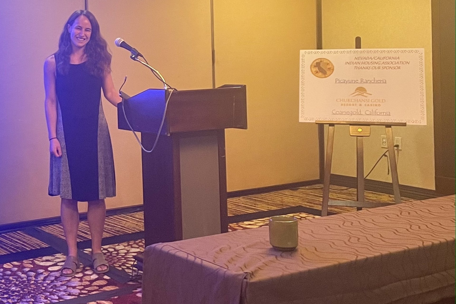
Marco Peralta Montoya, Junior, Political Science
Hi, my name is Marco, and I am currently working with the Stanford Political Psychology Research Group (PPRG) to research public opinion on the issue of global warming/climate change.
This summer is my first-ever opportunity in research, and before I started, I worried if I had enough to bring to the table and contribute to a project that was ready to conclude this summer after nearly two years of work. Working with six other wonderful RAs from the Political Science Research College, the Public Policy Summer Research College Program, and the Stanford Woods Institute for the Environment’s MUIR program, we have continued the efforts of previous undergraduate RA’s, visualizing and analyzing data collected by institutions such as Yale, Gallup, and Pew Research Center in climate change/global warming public opinion surveys. These surveys were conducted in the United States, and we have analyzed graphics like this one, which came from Yale. Across multiple years, Yale asked Americans whether they think that global warming is happening. As the graph illustrates, a consistent majority of Americans think that global warming is happening, a figure that has slowly increased over time from January 2010, to March 2021:

Our work this summer centers on the idea that survey organizations are always looking to ask the same questions to the American public about global warming and climate change - but they are finding and publishing different results. We believe that the disparity in results could be attributed to the differences in question wording between different surveys. While the organizations we collected the data from are interested in the same topics, the question wording in their surveys may be distinct enough that those surveyed respond differently, and, thus, lead to different results being published. For example, in this next graphic, Pew also wants to find out if Americans think that global warming is happening. However, differently from Yale, they have asked if there is “solid evidence” and do not reference global warming, instead asking about the Earth’s average temperature.

We are looking at each organization’s questions and asking if they can be compared against another organization’s question to find out if question wording is having a significant impact on responses. In our comparisons between questions from different organizations, each organization can have as many as 600 questions. Between two of our organizations, Pew and Yale, we found 67 questions that could be compared, each needing a graph and a written analysis that will later be published to the public. I have been able to contribute to the project by using R to automate our graph-making process and make all our data visualizations look similar. Here are the previous two graphs’ overlapping years compared using R:

These multi-organization comparisons help us identify any questions we think are similar enough - but with different results - that warrant inclusion in an experiment we are creating to recreate the results that these organizations have published and find out if question wording has an impact on results. Our ultimate goal in this project is to help the public better understand our attitudes toward global warming/climate change, its impacts, and proposals to fight climate change.


